

Dear Dr. Nellie and Colleagues,
I have completed the walkthrough video for Week 1, showcasing the layout of our course from both as a student and teacher perspective. For this task, I recorded my screen and provided a voiceover using Filmora 15 to walk you through the various sections and features available to us.
Course Walkthrough Video:
https://drive.google.com/file/d/1hvdg3zcOj983kmUeeR12HF5zZPP0gr3g/view?usp=sharing
Reflection Table:
| Element | Answers |
| Course Index | Provides a quick-access list of all modules and activities on the left side. |
| Topic Sections | Central area containing weekly lessons, instructions, and resources. |
| Block Area | Right-side panel containing extra blocks like 'Latest Announcements' or 'Completion Progress'. |
| User Experience | The layout feels very intuitive and reduces cognitive load by keeping navigation consistent. |
| Comparison | Moodle stands out due to its high level of customization for teachers compared to static platforms. |
| Practical Applications | This can be used in medical education to track student progress through complex diagnostic modules. |
| Suggestions | Adding more interactive progress bars could further increase student motivation. |
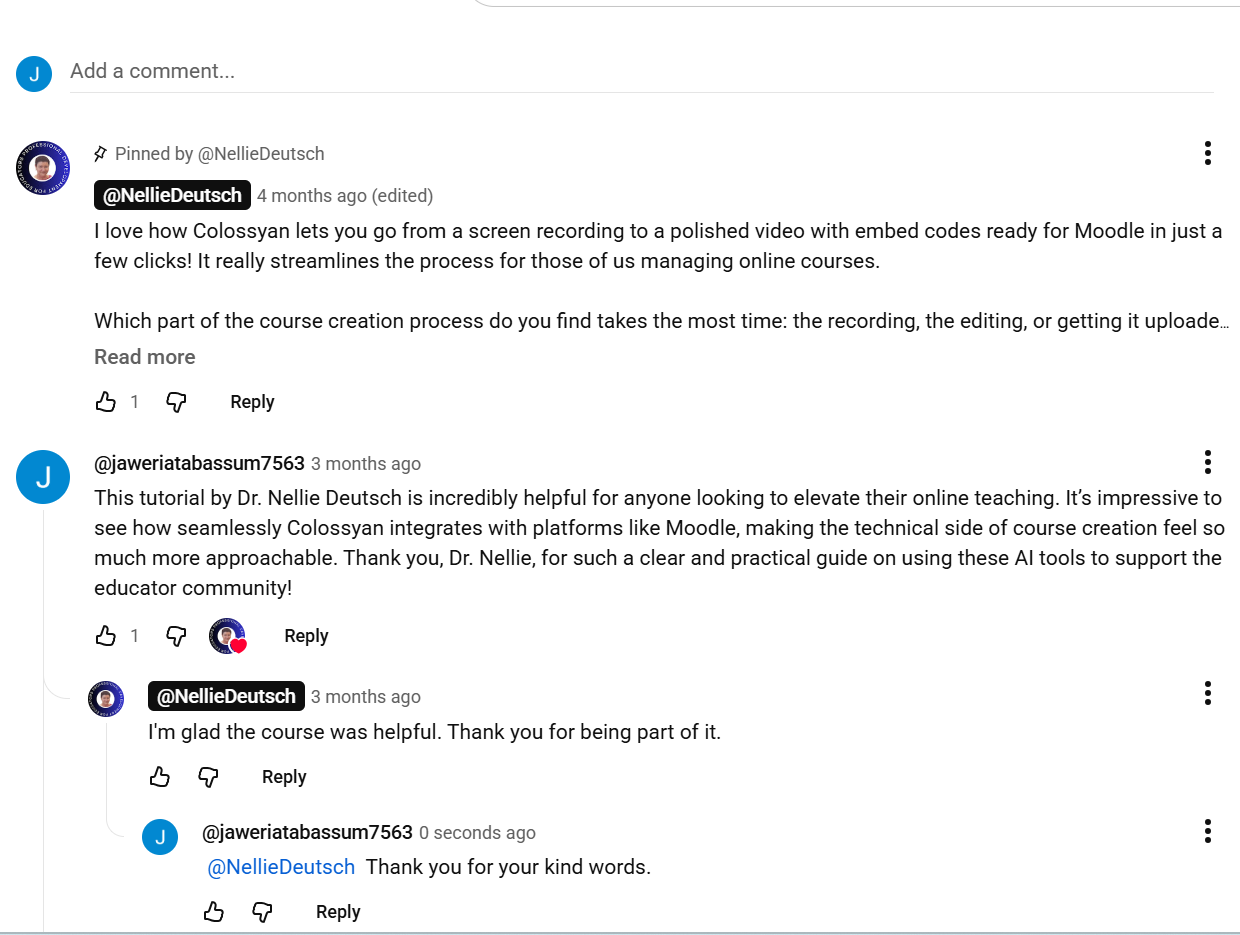
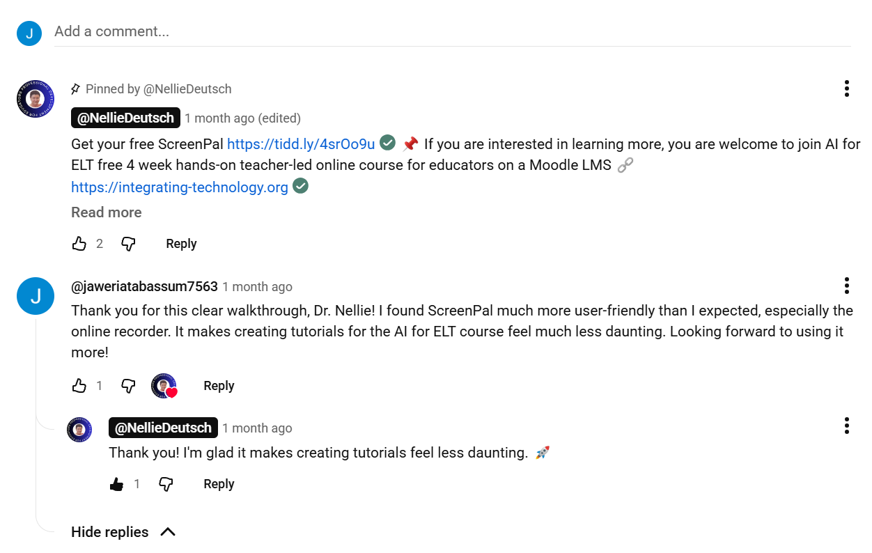
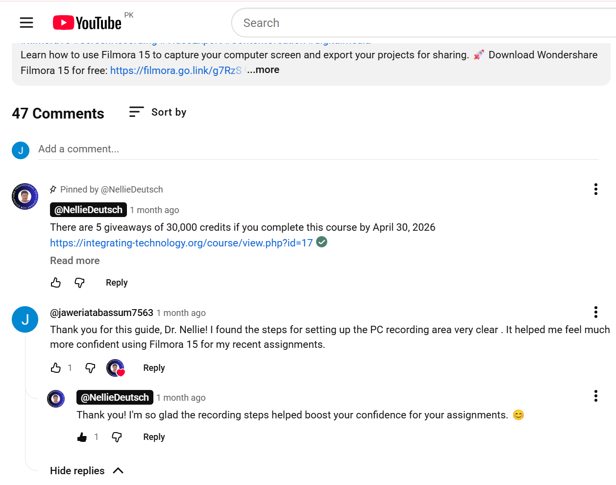
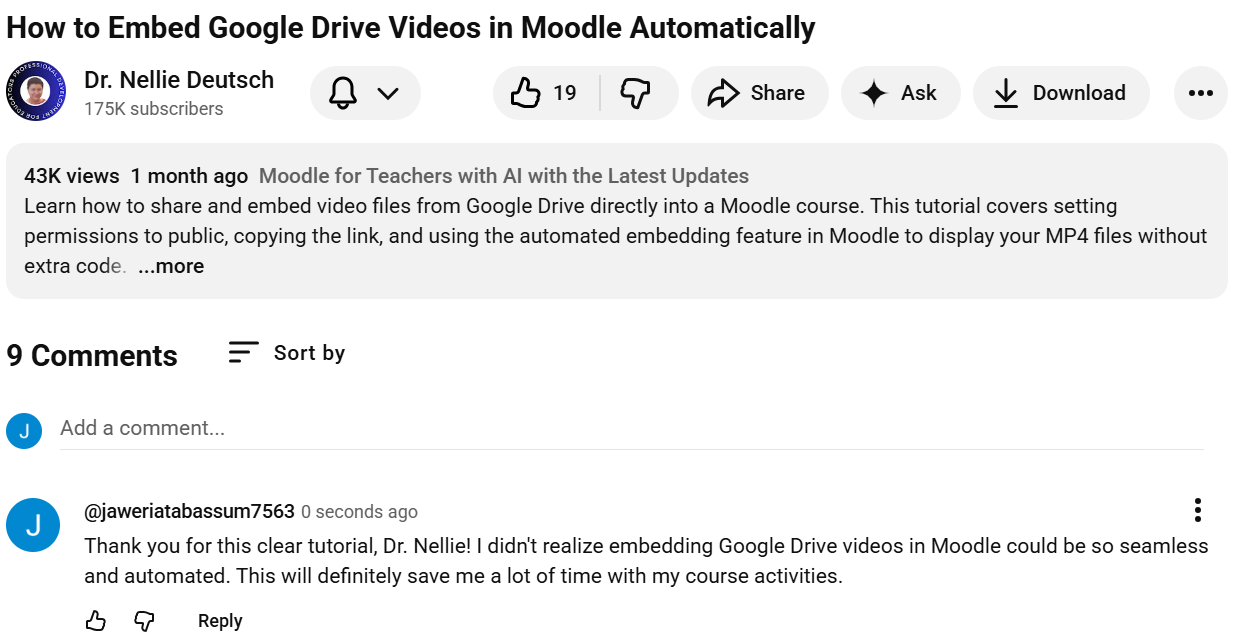
I have also watched the required tutorials and added my comments on YouTube. Please see the attached screenshot of my interaction below.
Warm regards,
Jaweria
